Prior to 1919, decisions about the structure, layout, typography, spacing, binding, decoration, and illustration of books issued under the various imprints of Toronto’s Methodist Book and Publishing House (MBPH) were largely editorial or production responsibilities. The concept of “book design” did not exist as we know it today. In fact, it would not be recognized as a distinct trade or craft until the twentieth century, so few publishing houses operated design or illustration departments. This was certainly true in Canada, where the book arts would not be taught in trade or fine art schools until the 1940s. In addition, illustration represented only a minor part of training in art schools, such as Montreal’s École des Beaux-arts1 and Toronto’s Ontario College of Art (now OCAD University).
Before the First World War, editorial figures at Canadian book publishing firms might make suggestions about layout, but the details of typography, printing, and decoration of a book were typically left to the “manufacturer,” whether that was an outside printing firm or, in the case of MBPH, the employees based in its own production facilities.2 The organization operated its own printing and binding departments and maintained a staff of long-serving craftspeople.3 Paper, typeface, and binding decisions were made based on obtainable supplies and available financing, the latter a significant concern since many of the books MBPH produced under its various imprints – most frequently the name of the book steward of the day – were issued at the expense of their own authors. Strictures on financial resources, combined with a small domestic market with limited interest in Canadian-authored books, discouraged experimentation. Indeed, there was little drive for risk-taking and originality, let alone production excellence. Usually, illustrations and additional decorations were managed either by purchasing plates from other sources or by hiring outside artists. Artists who worked with publishers were employed on a freelance basis, designing title pages, binding decorations, and page borders for one-off illustration projects.4 They were never on staff.

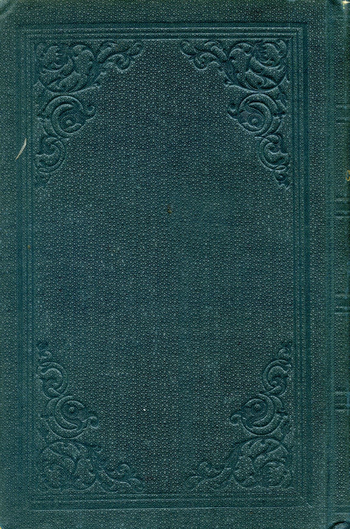
Up until the 1880s, many books printed and bound in MBPH’s plant received minimal decorative detailing. Publications from the 1860s5 had blind stamped6 cloth covers and minimal spine author/title information. Even a significant work, one rare at the time for being financially supported by the organization – John Carroll’s five-volume Case and His Cotemporaries (1867-1877) – was simply bound in dark green cloth, with blind stamped boards and minimal spine text. Although the bindings of the five volumes in Case and His Cotemporaries were consistent throughout the decade-long production, there are, in the copies found in Ryerson University Library’s McGraw-Hill Ryerson Press Collection, three different coloured endpapers – blue, cream, and yellow7 – probably determined by the availability and supply of papers, rather than any interest in design uniformity. Left to the production workers in the bindery, such minimally decorated books were typical of the period.

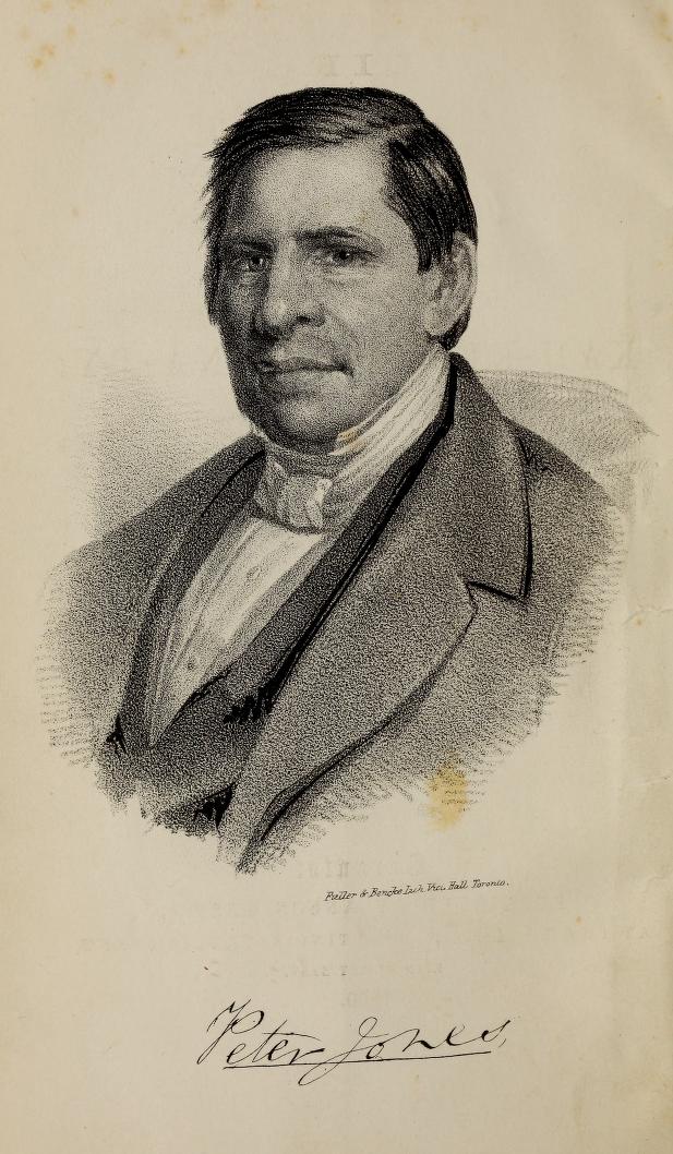
Extra content, especially in the form of photographs included in biographies of known church personalities, was one simple way to “decorate” a book. The portrait frontispiece became a standard feature during Samuel Rose’s period as book steward from 1865 to 1879, but it was not uncommon even during the earlier stewardships of Anson Green (1844-1854 and 1859-1865). Peter Jones’s Life and Journals of Kah-ke-wa-quo-nā-by (Rev. Peter Jones), Wesleyan Missionary (Toronto: Anson Green, 1860) includes a frontispiece by “Fuller & Bencke, Lith[ographers], Vict[oria] Hall, Toronto.”8 Apart from decorative blind stamping on the covers and text on the spine, this was a typical level of detailing for a MBPH book of the time.

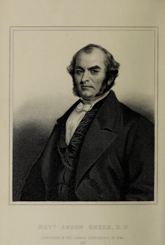
In another Carrol biography, Father Corson (Toronto: Samuel Rose, 1879),9 the simple binding is similar to other books of the period; the only difference is a portrait frontispiece signed “Rolph Smith & Co.,”10 a Toronto engraving and lithography firm. Other Methodist biographies tell a similar production story, albeit one slightly more elaborate. In Anson Green’s 1877 memoir, The Life and Times of the Rev. Anson Green, D.D.,11 there is a fine engraved portrait frontispiece labelled “Revd. Anson Green, D.D., President of the Canada Conference in 1842 and Representative to the British Conference in 1846 & 1854.” “The frontispiece,” Green writes, “is from a plate engraved for the Wesleyan magazine in 1855, and is too young for the author now, but not for him during the three-fourths of the period about which he has written.”12 Numerous other examples of frontispieces appeared in titles published prior to 1919, including many issued by Samuel Rose’s successor, book steward William Briggs, whose name became perhaps the most well-known trade book imprint in Canada prior to the First World War.
Briggs held the position of book steward from 1879 to 1919, and so his name served as the trade book imprint of MBPH for forty years. In The Ryerson Imprint, W. Stewart Wallace reflected on the physical nature of the books issued under that imprint: “William Briggs has published books in a decent and respectable format as became the Book Steward of the Methodist Church; but I cannot think that anyone was ever persuaded to buy one of his books because of its appearance.”13 In turn, and more generally, Canadian poet Bliss Carman, who in the 1890s had work issued by avant-garde publishers in Boston and New York who were highly attentive to book design and illustration, declared book manufacture in Canada of the day to be “vile” and cheaply set by comparison.14
Notwithstanding Wallace’s and Carman’s critiques, Briggs and his employees did perceive design and illustration as marketing tools to attract customers. After the book stewardship transitioned from Rose to Briggs in 1879, there was a concerted effort to make decorative and design decisions to improve the commercial appeal of books issued by “William Briggs.” In keeping with their publishing rivals in the market, typography, bindings, frontispieces, photographs, and illustrations, often all mixed together, became standard features of Briggs titles. Since he also faced the same financial challenges as his competitors in the Canadian book market, however, decorative work would only be added to the budget if sales were either assured or the extra costs paid by the author or via subscription (i.e. by signing up people to purchase the book).
Decorative elements crept into a number of books as the century advanced and were highlighted in the “catalogue of [William Briggs] publications” bound into the back of numerous volumes. For example, the one bound into the back of David Hickey’s William and Mary: A Tale of the Siege of Louisburg, 1745 (1884) reveals the extent but also the limitations of the decoration and special features of Briggs’s publications. The list references the following: Egerton Ryerson’s The Loyalists of America and Their Times: From 1620 to 1816 (1880) was bound in “half morocco,” Canadian Methodism: Its Epochs and Characteristics (1882) “handsomely bound in extra cloth with Steel Portrait of the Author,” and The Story of My Life: Being Reminiscences of Sixty Years’ Public Service in Canada (1883) was published “With [a] Steel Portrait and illustrations”; John Lathern’s The Hon. Judge Wilmot: A Biographical Sketch (1881) included an “Artotype portrait”; and David Rogers’s Shot and Shell for the Temperance Conflict (1884) was published “With Illustrations” and “Bound in handsome style in extra English cloth, with ink stamping and gold lettering.” William H. Withrow’s A Popular History of the Dominion of Canada (1886)15 was “Sold only by subscription” and included “Eight steel portraits, one Hundred wood cuts, and six coloured maps.” As the last item in the list suggests, special features were often added only to the more expensive, subscription-type editions that took hold in the market in the late decades of the nineteenth century.16


In the competitive world of Canadian and international book publishing of the late-nineteenth century – an era in which dust jackets were not yet a common feature – bindings were the public face of a book. As Greta Golick notes, bindings “served as a marketing tool in an emerging consumer culture.”18 For trade titles issued under the Briggs imprint, much of the in-house binding work was done using imported book cloth, in-stock typefaces, and stamp ornaments. For agency titles imported in sheets, the binding was the only feature for which MPBH was directly responsible.


Before 1900, binding designs were seldom created for specific titles; instead, bindings featured decorative stamps and elements that could be used in variation and interchangeably. The blind stamped bindings of the mid-century were now replaced by ornamental decorations and lettering. As Judy Donnelly explains, by the 1880s and 1890s “Symmetry was abandoned, and oriental motifs and lettering were popular, especially when combined with black [and multi-coloured] stamping. By the 1880s a single cover might include several pictorial motifs – not always related to the content of the book – crowded in with decorative elements and exotic lettering of various disparate styles. These designs,” she adds, “were most commonly blocked in bold on the plain cloths that had become standard by the last decade of the century.”19

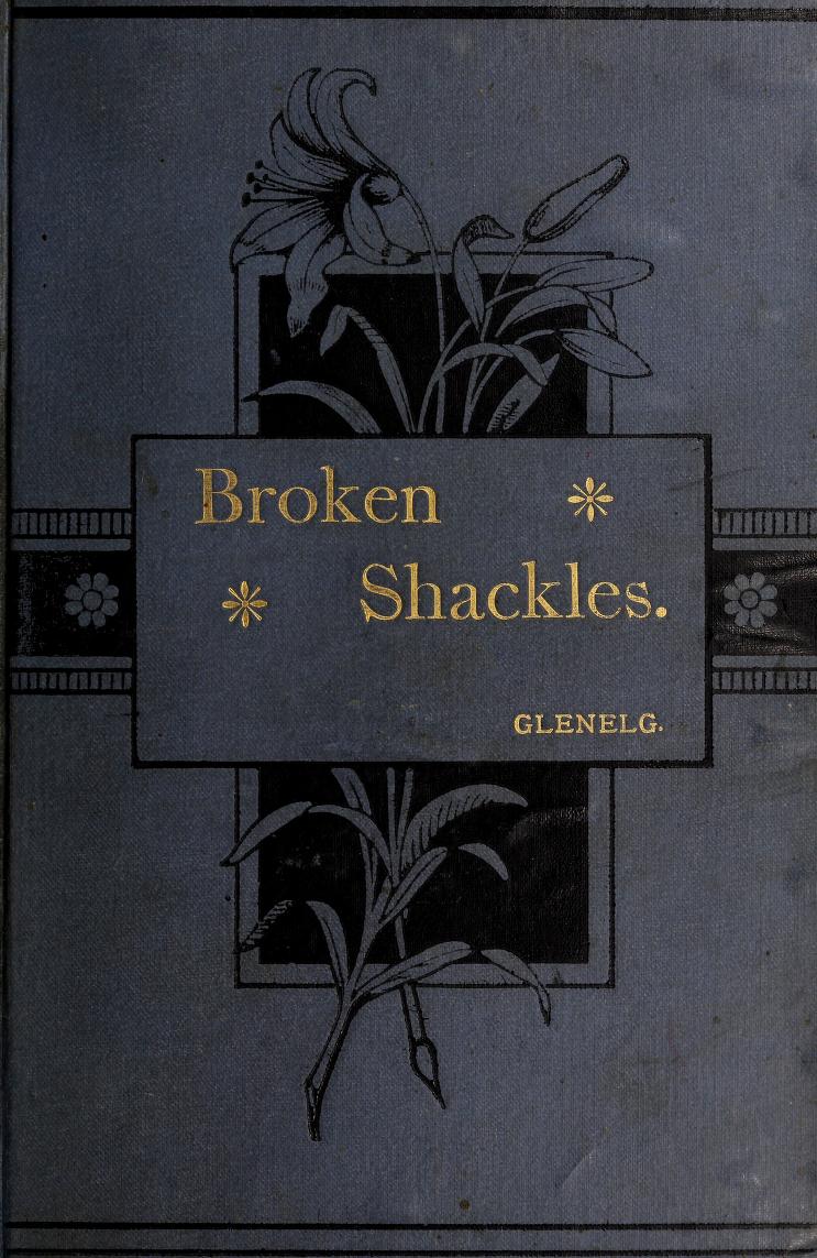
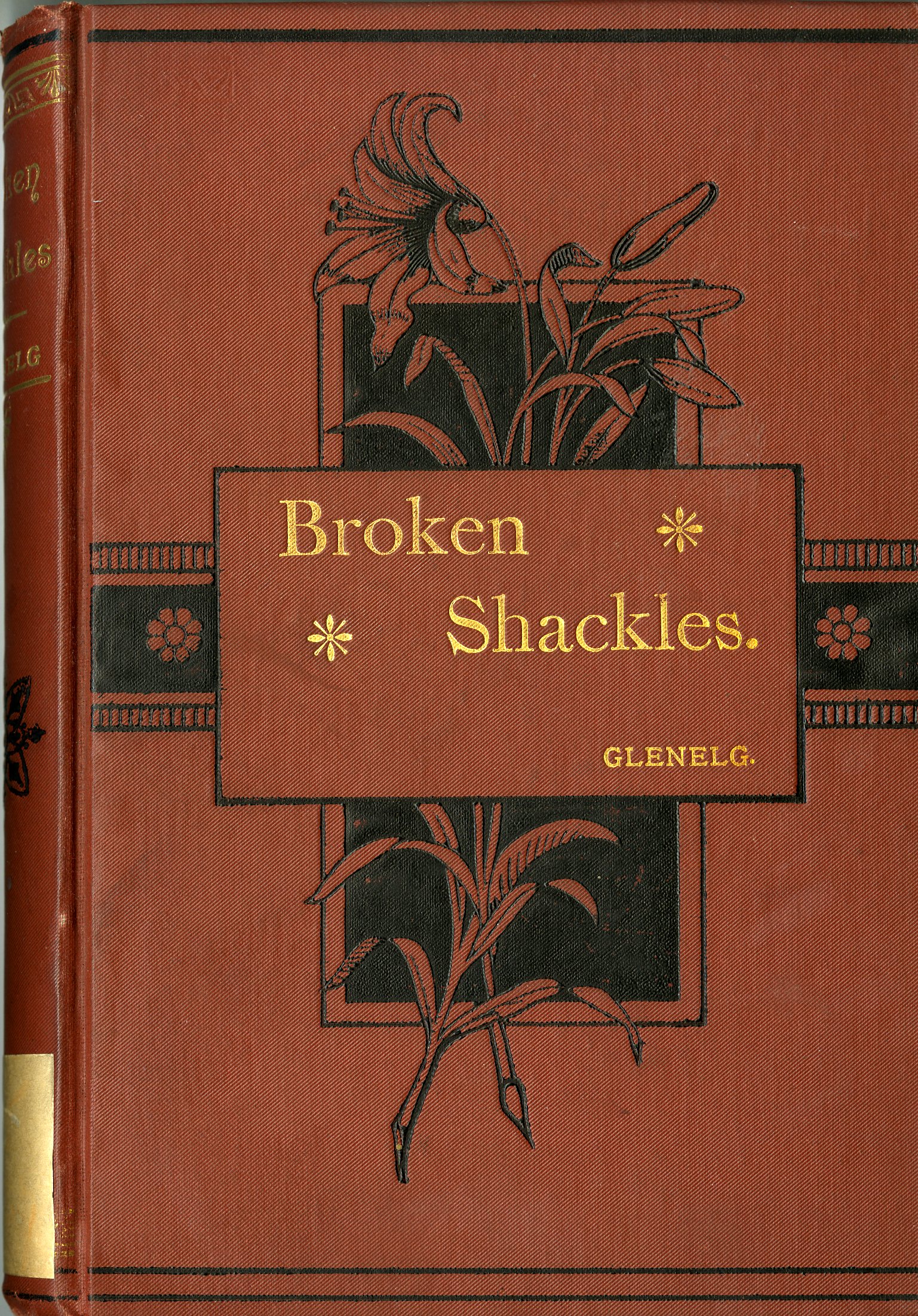
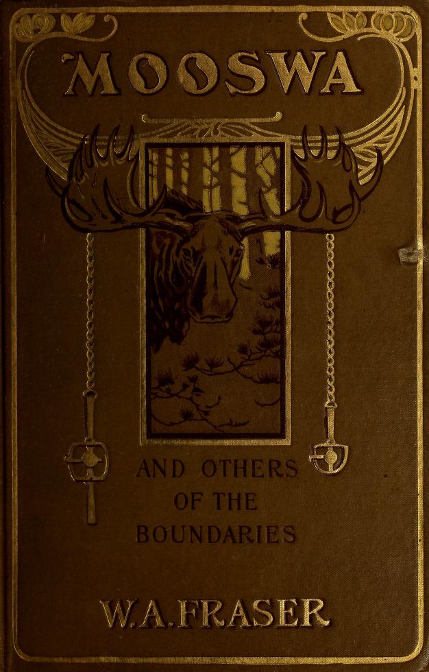
Trends in book decoration shifted over time. In the 1890s, as the Arts and Crafts movement grew in influence, floral and botanical designs in multiple colours were increasingly popular in the decoration of bindings issued under the Briggs imprint. Examples are to be found in Glenelg’s Broken Shackles (1889), Catharine Parr Traill’s Pearls and Pebbles; or, Notes of an Old Naturalist (1894), and William H. Withrow’s Barbara Heck: A Tale of Early Methodism (1895).20 After 1900, botanical images began to be replaced with pictorial images that, in some cases, actually matched the content. W.A. Fraser’s Mooswa and Others of the Boundaries (1900), Virna Sheard’s novel By the Queen’s Grace (1904), Robert Lorne Richardson’s The Camerons of Bruce (1906), and William J. Fischer’s The Toiler and Other Poems (1907) are excellent examples. By 1909, bindings were also featuring paper appliqués (photographic reproductions of art work or sketches) pasted to the front cover for titles such as Thaddeus A. Browne’s The White Plague and Other Poems (1909), Suzanne Marny’s Tales of Old Toronto (1909), and Nellie McClung’s novel Sowing Seeds in Danny (1912).
Similar binding practices were common amongst Canadian firms. MBPH was different only because it produced its own work; most other Toronto firms used outside commercial printers and binders. Bindings were typically not signed or credited within the text since it was not the practice to acknowledge the staff or binding decorators. To date, I have found only one exception: the front cover of Sheard’s novel By the Queen’s Grace is signed with a capital “H” (who is yet to be identified) in the bottom right corner. Just as special features were added to the expensive subscription editions, the same applied to bindings of highly popular books and established texts. As subsequent printings were made available, Briggs could offer different binding options at different price points to readers of all economic backgrounds and for multiple purposes (prize giving, for example). Binding variants were therefore not that uncommon.21

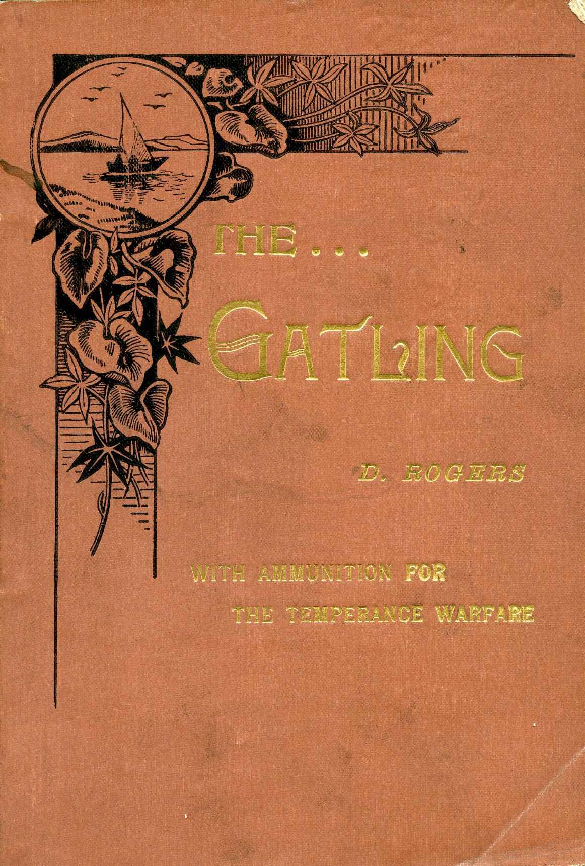
In the cautious environment of Canadian book publishing prior to 1919, illustration was used sparingly. As late as 1900, most illustrated books could be author-funded, agency titles whose elements of Canadian manufacture might only extend to local binding (or, on occasion, a tipped-in photograph), or Canadian books which used internationally sourced illustrations. David Rogers’s The … Gatling: With Ammunition for the Temperance Warfare (Toronto: William Briggs, 1894)22 is an example of the latter. Published in paper covers, the illustrations are drawn from a number of sources; many are unsigned, including the portrait frontispiece and the image of a man and a gatling gun decorating the first chapter. Some illustrations, however, are identified: one is signed “Butterworth & Heath Co.,” a British printing firm; another may be the work of Canadian cartoonist and illustrator J.W. Bengough.23 Additional illustrations may be American in origin. For instance, there is the striking “A Word to the Boys and Girls about Reading” by American illustrator Frank Beard: it portrays the devil pouring “Scandal, Immorality and Infidelity” into the water from a position above a waterfall that cascades down as Literature, and where at its base one finds the boys and girls drinking the contamination.24 No illustration better illuminates the moral trepidation or uncertainty about fiction still operational in North American society in the late-nineteenth century.
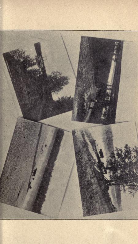
Despite anxieties associated with their cost, by 1900 Briggs’s titles included illustrations when his organization either took a particular interest in a book or deemed it important.25 Although Alexander McLachlan’s Poetical Works (1900) appeared in an undecorated binding in reddish brown cloth, it included a portrait frontispiece (an unsigned sketch), along with other images and sketches by the Canadian artist Arthur Cox.26 The book was done simply, but with taste and care. The spacing within the interior is excellent, with generous borders around the text blocks. Edward S. Caswell, who was serving as manager of MBPH’s book publishing department when the work appeared, considered McLachlan a notable Canadian poet27 and he may have had some influence over the physical appearance of the book. Even illustrated work paid for at the organization’s “own risk”28 for an established author such as Catharine Parr Traill, whose book Cot and Cradle Stories (1895) was published with a portrait frontispiece “by a clever artist from a recent photograph,” along with illustrations by “Mr. Patterson,”29 could not guarantee good artistic results. Traill expressed disappointment with the illustrations in her book. Caswell, who was also unsatisfied with the results, wrote to the author: “I thought we were fortunate in getting Mr. Patterson.” Still, he reflected, to the average reader the illustrations “will look alright. Not all who read the book will have high artistic expectations.”30 Tellingly, no illustrator is listed on the title page.


Illustration continued to be a challenge after 1900. Ongoing cautiousness meant it was 1908 before there appeared, under the Briggs imprint, “the first Canadian work of fiction to contain colour illustrations drawn, engraved and printed” by a Canadian firm.31 That book was Margaret A. Brown’s My Lady of the Snows (1908). The engraver is not credited and the unsigned illustrations were poor imitations of eighteenth-century painting; the results were tepid. In turn, “author’s editions” – which signalled cases where the author paid the full production costs – could often have unfortunate results. Thaddeus A. Browne’s The White Plague and Other Poems (1909) included black and white illustrations by the virtually unknown L. Revera and A. Gay. Along with a photographic portrait frontispiece of the author, there were seven reproductions on tipped-in, coated paper; four were by Gay and the rest by Revera. All were amateurish, especially those by Revera. The front cover image is a reproduction in black and white of an illustration by Gay depicting the poem “Malignant, repellent, appalling, Elate on his death-reared throne.” Indeed!
From the 1890s onward, MBPH did begin to hire, commission, or, at least, purchase illustrations by Canadian artists working in Toronto. Names such as Arthur Cox (1840-1917), J.W. Bengough (1851-1923), Arthur Heming (1870-1940), Alfred M. Wickson (1877-1947), George E. McElroy (1878-1945), J.E. Laughlin (fl. 1895-1900), Maria Nicholl, and A.E. Weaver all did work for Briggs during that decade, and continued to do so into the twentieth century. As well, work by American illustrators (no doubt reproduced from agency books published in Canada) such as Frank Beard (1842-1905), J.E. McBurney (1868-1955), and John Conacher (1876-1947) were all featured.
Book publishing activity slowed dramatically during and immediately after the First World War, when Briggs was in the final years of his book stewardship. While wartime shortages around labour and supplies accounted for some of that decline, the firm also suffered a serious blow with the sudden death of F. Sidney Ewens (1872-1914). Ewens had served as manager of the newly created publicity department from 1908 to 1909, and then succeeded Caswell as manager of the book publishing department in 1909.32 Caswell’s obituary credited Ewens’s “encouragement and personal interest” with “the bringing out of many volumes which would otherwise never have seen the light of publicity.”33


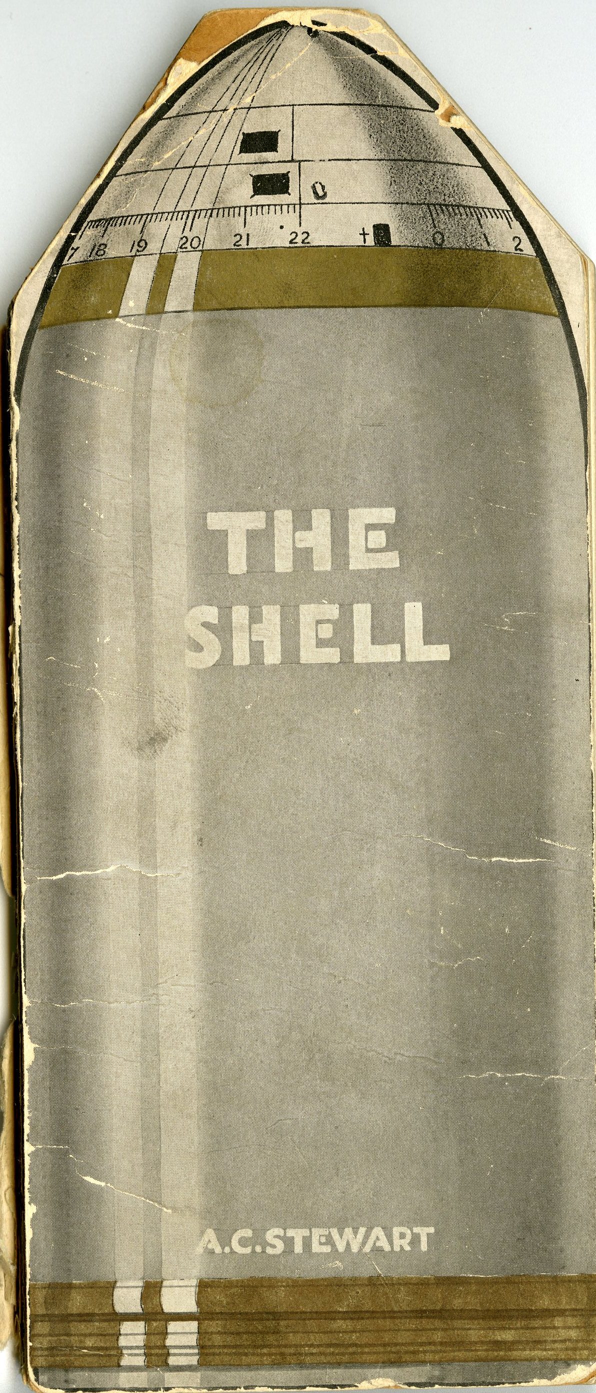
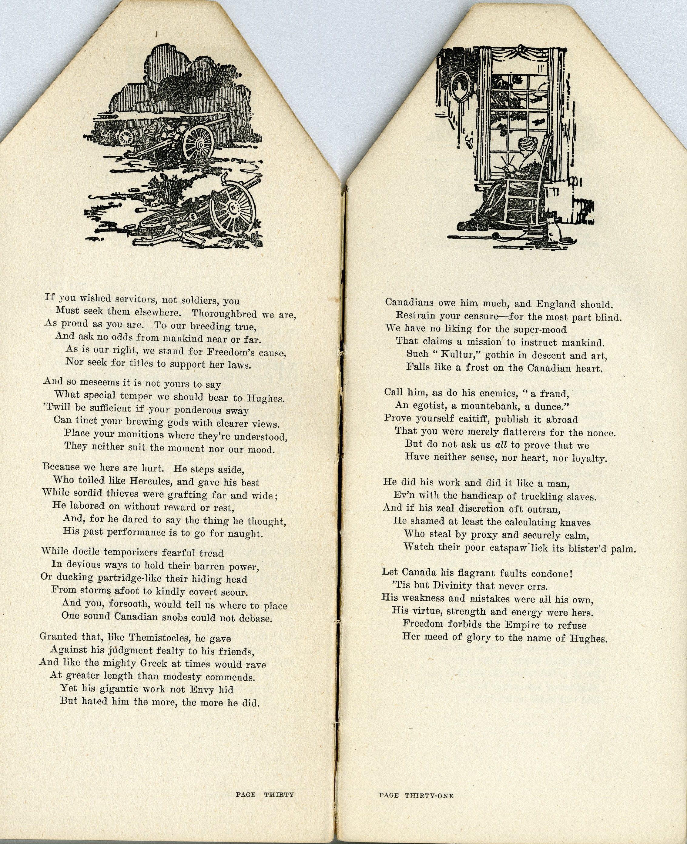
Still, the support of the war effort by the Methodist Church and its book publishing arm resulted in a number of war-related items that demonstrate an outpouring of creative energy. Several outstanding productions were the result. Even an agency title such as H. Warner Allen’s The Unbroken Line along the French Trenches from Switzerland to the North Sea (1916), albeit with an interior printed by the Whitefriars Press in London, was handled with care by William Briggs in answer to the need for war information. Memorial volumes of poetry and remembrance, paid for by grieving families, such as Pen Pictures from the Trenches (1918) by Lieutenant Stanley A. Rutledge (1889-1917), were produced with care and attention and indicate a new interest and commitment to quality work. The most astonishing in terms of book design was A.C. Stewart’s 69-page The Shell: With Fragments and Reverberations (1917). Shaped like a military shell, the front paper cover depicts a high-explosive shell with text in white. The interior has two illustrations (unsigned) that are repeated on every other page. On the recto, an elderly woman depicted in Victorian dress sits knitting in front of a large window, with a cat seated beside her chair. On the verso, soldiers firing mounted guns are surrounded by rising smoke; pictured in the foreground is a smashed gun carriage and a dead soldier. Since the Irish-born Stewart (1867-1944) was active in Canada as a “fiercely independent poet and building contractor,”34 one assumes this was a Toronto production.
The First World War truly marked the end of the long nineteenth century, as well as the twilight of William Briggs’s lengthy book stewardship at MBPH. Society was changed by the war. The result was a new nationalism and a firm belief in Canada’s importance to the wider world; Canada’s book publishers imbibed some of that spirit. A number of the final, wartime titles to be issued under the Briggs imprint would foreshadow the creative work that was to follow in the 1920s, after MBPH began to issue trade books under the Ryerson Press imprint. By 1919, a twentieth-century approach to book illustration and design was ready to take hold.
1 Guy de Grosbois, “The Graphic Arts in Quebec,” in History of the Book in Canada, Volume 3, 1918-1980, ed. Carole Gerson and Jacques Michon (Toronto: U of Toronto P, 2007) 371.
2 Judy Donnelly, “Book Cover Design,” in History of the Book In Canada, Volume 2, 1840-1918, ed. Yvan Lamonde, Patricia Lockhart Fleming, and Fiona A. Black (Toronto: U of Toronto P, 2005) 106.
3 Randall Speller, “Book Design in English Canada,” in History of the Book in Canada, Volume 3, 1918-1980, ed. Carole Gerson and Jacques Michon (Toronto: U of Toronto P, 2007) 378. See also “William L. Cope,” The Book Rumour [Published by the House Committee of the Ryerson Press] 54 (June 1945): 2.
4 See Crispin Elsted, review of Aesthetic Tracts: Innovations in Late-Nineteenth Century Book Design, by Ellen Mazur Thomson, Papers of the Bibliographical Society of Canada 55.1 (Spring 2017): 174-78.
5 See, for example, George F. Playter’s The History of Methodism in Canada (Toronto: Published for the Author by Anson Green, 1862). See also Peter Jones’s Life and Journals of Kah-ke-wa-quo-nā-by (Rev. Peter Jones), Wesleyan Missionary (Toronto: Anson Green, 1860).
6 A blind stamp (blind meaning uncoloured) is an image, decoration, or lettering on a book cover formed by creating an impression on the surface. A metal plate or piece of type is set in the press and the cover is run through the press to create a colourless impression. Blind or ghost images are often used to decorate the back covers of books.
7 Blue endpapers in volumes one and three; cream endpapers in volume two; and yellow endpapers in volumes four and five.
8 See Elizabeth Hulse, A Dictionary of Toronto Printers, Publishers, Booksellers and the Allied Trades, 1798-1900 (Toronto: Anson-Cartwright Editions, 1982) 102. Roddy and Reilly were the printers (Hulse 219).
9 John Carroll, “Father Corson”; or, the Old Style Canadian Itinerant: Embracing the Life and Gospel Labours of the Rev. Robert Corson, Fifty-Six Years a Minister in Connection with Central Methodism of Upper Canada (Toronto: Samuel Rose, 1879).
10 See Hulse 220.
11 Anson Green, The Life and Times of the Rev. Anson Green, D.D. Written by Himself at the Request of the Toronto Conference, and Presented to the Church for the Benefit of the Superannuation Fund (Toronto: Methodist Book Room, 1877).
12 Green [xii].
13 W. Stewart Wallace, The Ryerson Imprint: A Check-list of Books and Pamphlets Published by The Ryerson Press since the Foundation of the House in 1829 (Toronto: Ryerson Press, [1954]) 6.
14 Carman quoted in Margaret Lock, “Bliss Carman and Book Design in the 1890s,” DA: A Journal of the Printing Arts 61 (2007): 7. While these American illustrators and printers were twenty to thirty years ahead of what was being practiced in Toronto, it must be said that all these Boston and New York firms soon went bankrupt. They were not competing in the same commercial markets as Briggs.
15 Most likely William H. Withrow, A Popular History of the Dominion of Canada: From the Discovery of America to the Present Time, Including a History of the Provinces of Ontario, Quebec, New Brunswick, Nova Scotia, Prince Edward Island, British Columbia, and Manitoba; of the North-West Territory, and of the Island of Newfoundland (Toronto: William Briggs, 1886). In the catalogue of Library and Archives Canada (LAC), this book is identified as “Rev. and extended ed. brought down to 1886.” The LAC catalogue also identifies a book by the same title and author issued by Boston publisher B.B. Russell in 1878, presumably an earlier edition.
16 For more about this era of subscription-book publishing in Canada, see George L. Parker, The Beginnings of the Book Trade in Canada (Toronto: U of Toronto P, 1985) 196-201.
17 A “tipped in page” is attached to a book either by being glued to an existing printed page or signature, or bound in alongside a page or between signatures.
18 Greta Golick, review of Bound to be Modern: Publisher’s Cloth Bindings and the Material Culture of the Book, 1840-1914, by Kristina Lundblad, Papers of the Bibliographical Society of Canada 55.1 (Spring 2017): 150.
19 Donnelly 108.
20 Binding variants were common, especially if there were several editions, impressions, or reprints. Ryerson University Library’s copy of Withrow’s Barbara Heck: A Tale of Early Methodism has grey boards with gilt text. A branch with leaves and fruit in green, yellow, red, and white, set against a golden sun, decorates the cover. I own a variant binding. Also dated 1895, but given as a presentation copy in 1896 “as an acknowledgement of diligence and fidelity in collecting Funds for the Missionary Society” and published by the “Methodist Mission Rooms,” the book is bound in blue machine cloth, with text in gilt, and botanical decorations in black. No attempt has been made to repeat the decoration. It is obviously a cheaper edition.
21 Donnelly 108.
22 David Rogers, The Gatling: With Ammunition for the Temperance Warfare (Toronto: William Briggs; Montreal: C.W. Coates, 1894) 26.
23 Rogers 48. “One of Our Institutions,” cartoon signed J.W.B.
24 Rogers 121.
25 See also Janet B. Friskney, “Beyond the Shadow of William Briggs, Part II: Canadian-Authored Titles and the Commitment to Canadian Writing,” Papers of the Bibliographical Society of Canada 35.2 (Fall 1997): 181-82.
26 Cox’s images include a reproduction of a “pen and ink sketch by Arthur Cox, A.R.C.A.” (p. 16); a black and white reproduction of an Arthur Cox painting (between pp. 206-07); and a reproduction of a photograph taken in 1890 by Arthur Cox (between pp. 366-67).
27 Edward S. Caswell, “Time on Our Side,” Canadian Magazine (April 1913): 581-82.
28 Friskney, “Beyond the Shadow of William Briggs, Part II” 179.
29 Possibly Andrew Dickson Patterson (1854-1930).
30 MG29-D81, volume 1, Traill Family Collection Papers, Library and Archives Canada. I want to thank Janet Friskney for providing this information.
31 Friskney, “Beyond the Shadow of William Briggs, Part II” 181.
32 Janet B. Friskney, “Beyond the Shadow of William Briggs, Part I: Setting the Stage and Introducing the Players,” Papers of the Bibliographical Society of Canada 33.2 (Fall 1995): 148.
33 Caswell quoted in Friskney, “Beyond the Shadow of William Briggs, Part I” 149.
34 D.M.R. Bentley, The Gay Grey Moose: Essays on the Ecologies and Mythologies of Canadian Poetry 1690-1990 (Ottawa: U of Ottawa P, 1992) 129.