Throughout their history, published books have carried logos as graphic symbols. Logos can be read superficially as mere emblems, but book design experts know the profound significance of an effective publisher’s logo, which does more than simply identify a press. A compelling logo, as editor Lorne Pierce understood, is the visual representation of a firm and its core beliefs.1 It reflects the history and heritage of a publishing house and can evoke an emotional response in readers and book collectors.2 In fact, a successful and well-designed logo can become a key characteristic of a publishing house and the books it produces.

The earliest civilizations used symbols to signify “spiritual beliefs.”3 Eventually, these symbols were put “to utilitarian uses, [and] emblems were combined with commercial concepts”4 to form what we would now regard as early examples of logos. In the thirteenth century, for example, members of European guilds, or associations of craftsmen, began using guild-approved signs to mark their goods and to identify individual makers. During the seventeenth century, Italians papermakers began to differentiate themselves by applying watermarks to paper.5 The logo as we now understand it, however, did not come into wide use until the Industrial Revolution, which saw a rise in commercialization and cultural exchange and the attendant need for companies to identify themselves in a growing marketplace.6 Since that time, the aesthetics of all business logos, including publishers’ logos, have adapted to ever-changing cultural and social trends.


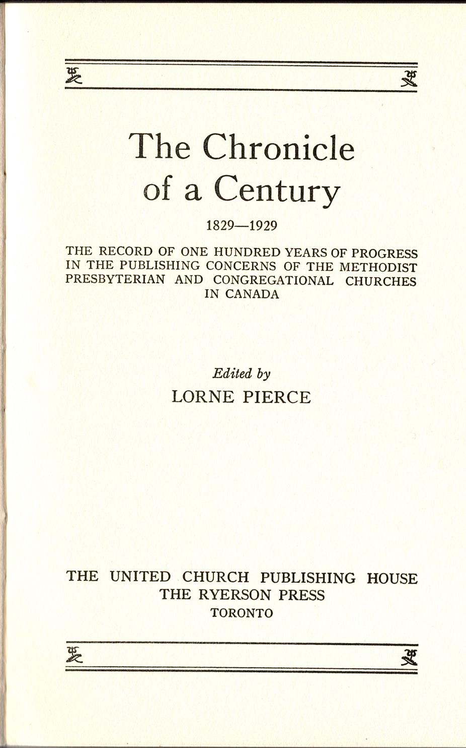
In 1920, when Lorne Pierce joined Ryerson, the Press was also the publishing vehicle for the Methodist Church and, after Church Union in 1925, the United Church of Canada. Pierce’s edited volume, The Chronicle of a Century, 1829-1929 (1929), an overview of the Methodist, Presbyterian, and Congregational churches in Canada, carried an early example of the joint United Church-Ryerson logo. The logo, which does not include an image, simply names the two publishing imprints: “THE UNITED CHURCH PUBLISHING HOUSE / THE RYERSON PRESS.” The font is serif and the black capital lettering on white paper stands out. In later years, Ryerson used variations on this logo. By 1938, for example, the Press had solidified, as reflected in the logo in figure two: “THE RYERSON PRESS – TORONTO.”
Over the course of his long editorial career – he remained with the Press until 1960 – Pierce ensured that Ryerson Press books were professionally designed and illustrated. To reflect his own nationalism and interest in Canadian art, he hired a select group of Toronto-based artists who were responsible for creating dust jackets, title pages, and other graphic elements of books.7 By 1940, Ryerson books had their own distinctive graphic identity crafted, in large part, by artists C.W. Jefferys and Thoreau MacDonald, who worked under Pierce’s artistic direction.8
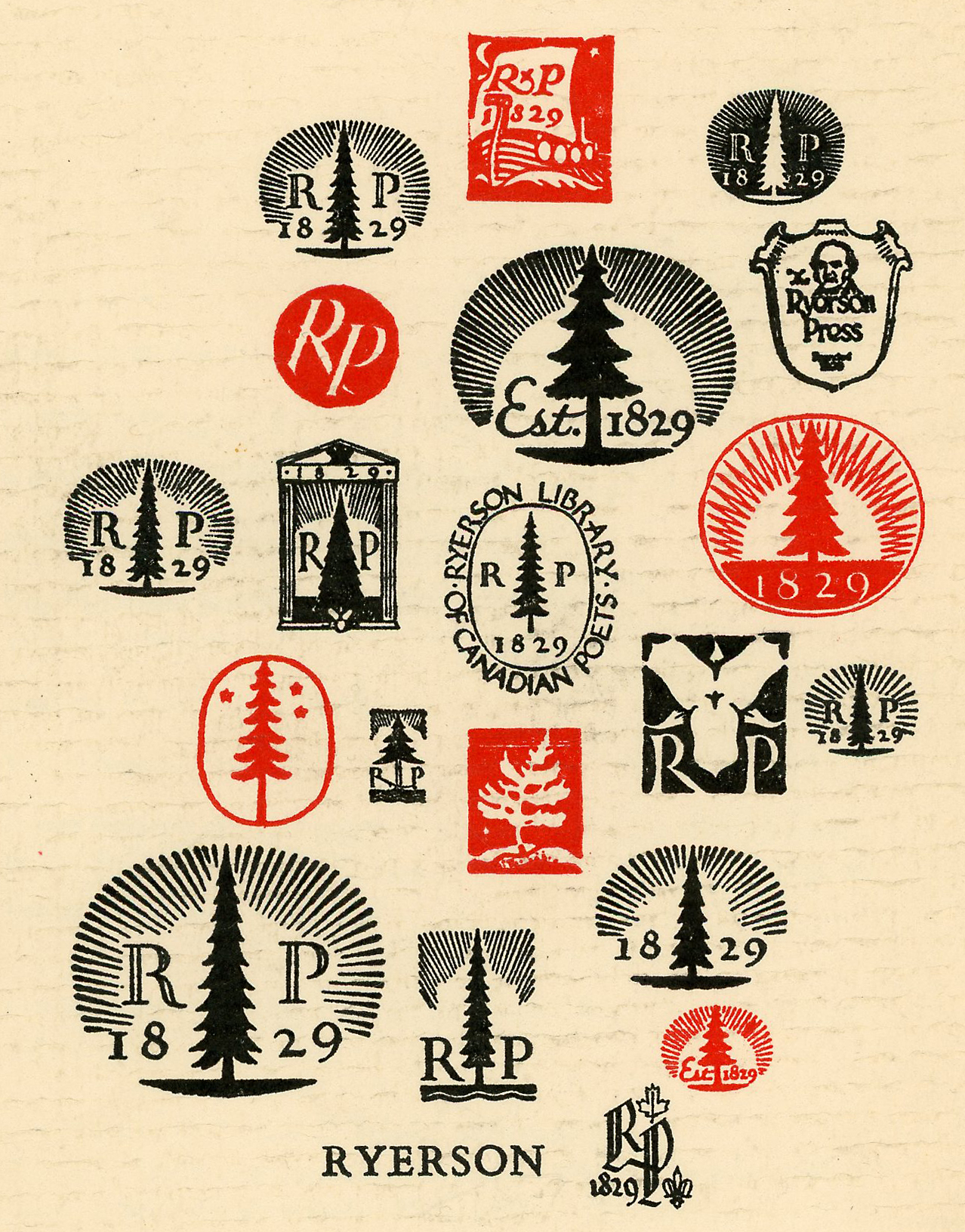
Jefferys was an illustrator whose images, heavily inspired by Canadian history, were important features of most textbooks issued by Ryerson Press.9 MacDonald’s style was simpler; his bold, modern hand lettering balanced each page layout.10 Ryerson’s most recognizable logo (displayed at the right) was the work of MacDonald. The distinctive logo, which exemplified MacDonald’s style, incorporated a graphic of a tree with the letters R and P – for Ryerson Press – and the date 1829 – the year the Methodist Book and Publishing House, which later became the Ryerson Press, was founded.11 The design of the logo incorporated detailed line work in the graphics and the lettering. When necessary, this logo could be sized down without losing legibility.
Three variations on MacDonald’s iconic logo appear below.
In 1949, Arthur Steven was hired as in-house art director at Ryerson Press. To increase profits from book sales, Steven brought in new design ideas and was responsible for the later iterations of the Ryerson Press logo.12 One version of Steven’s logo was a modern, scaled-down adaptation of MacDonald’s logo that retained a simple image of a tree, positioned in the midst of the imprint: “The Ryerson Press [tree image] Toronto.” This version was more commercial, in keeping with the new focus of Pierce’s artistic direction.13 Since it lacked a lot of graphic detail and took up less space on the page, Steven’s logo also had the advantage of being both legible and easy to reproduce. Steven remained in-house art director until 1970, when the McGraw-Hill Company purchased Ryerson Press.14
Today, the long history and evolution of Ryerson Press is traceable through its logos, which were always more than mere emblems. Taken together, the logos chart the company’s progress, core values, and sense of pride in issuing books designed by Canadian artists for Canadian readers. The logos of the Ryerson Press also evoke the firm’s Canadian heritage and its influential role in Canadian book design and publishing.
1 C. Whan Park, Andreas B. Eisingerich, and Grantiana Pol, “The Power of a Good Logo,” MIT Sloan Management Review 55.2 (2014): 11.
2 Park, Eisingerich, and Pol 12.
3 Shijian Lin and Shan ben tu shu, Logo Style: Decorative, Modern, Postmodern, Digital (Hong Kong: SendPoints Publishing, 2018) 4.
4 Lin and ben tu shu 4.
5 Lin and ben tu shu 4.
6 Lin and ben tu shu 9.
7 Randall Speller, “Arthur Steven at the Ryerson Press: Designing the Post-War Years (1949-1969),” Papers of the Bibliographical Society of Canada 41.2 (Fall 2003): 9.
8 Speller 9.
9 Speller 10.
10 Speller 10.
11 Sandra Campbell, “Nationalism, Morality, and Gender: Lorne Pierce and the Canadian Literary Canon, 1920-60,” Papers of the Bibliographical Society of Canada 32.2 (Fall 1994): 138.
12 Speller 11.
13 Speller 15.
14 Speller 13. See also George L. Parker, “The Sale of Ryerson Press: The End of the Old Agency System and Conflicts over Domestic and Foreign Ownership in the Canadian Publishing Industry, 1970-1986,” Papers of the Bibliographical Society of Canada 40.2 (Fall 2002): 7-55; and Ruth Bradley-St-Cyr, “The Downfall of the Ryerson Press,” PhD Dissertation, U of Ottawa, 2014.